Storybook: The Ultimate Guide
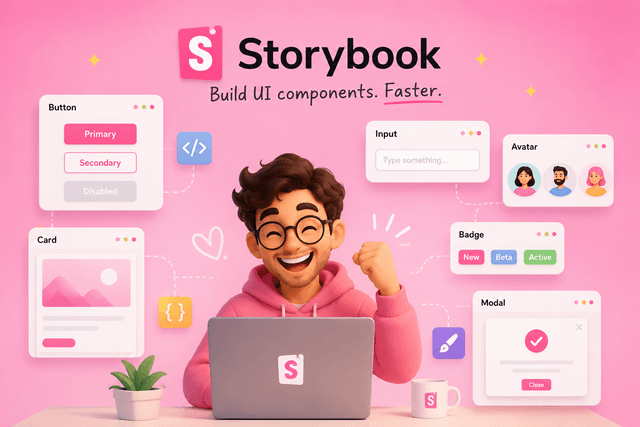
Storybook: The Ultimate Guide (From Zero to Hero)
If you've worked with React for a while, you've probably heard developers mention Storybook.
At first, it might seem like just another development tool.
Maybe you've seen screenshots like this:
- A sidebar with component names
- A preview of a button
- Some controls on the right
And your first thought is probably:
"Why would I need another application just to see my components?"
It's a fair question.
The truth is that Storybook is much more than a component viewer.
It's a development environment, a documentation platform, a testing tool, and for many teams, the single source of truth for their design system.
By the end of this article, you'll understand:
- What Storybook is
- Why it exists
- Why companies love it
- Why it's useful even for personal projects
- Its biggest features
- How to get started in just a few minutes
The problem Storybook tries to solve
Imagine you're building an e-commerce website.
You create a simple Button component.
<Button>Buy now</Button>Seems easy.
But then you realize the button can have many variations.
<Button variant="primary" />

<Button variant="secondary" />

<Button disabled />

<Button loading />

<Button icon="cart" />
Now imagine that button is used in:
- Product pages
- Shopping cart
- Checkout
- User profile
- Admin dashboard
- Marketing pages
Every time you modify the button, you need to navigate through your application to find a page where that particular version appears.
Sometimes that page isn't even available yet.
Sometimes the button only appears after:
- logging in
- adding products
- filling a form
- reaching checkout
- triggering an error
Testing your component becomes surprisingly annoying.
Traditional component development
Without Storybook, the workflow usually looks like this.
You change your component.
↓
Run your application.
↓
Navigate through several pages.
↓
Try to reach the correct state.
↓
See the component.
↓
Go back.
↓
Repeat.
It works...
But it's slow.
Storybook changes the workflow
Storybook asks a simple question:
What if every component had its own little playground?
Instead of viewing a button inside an entire application...
You can view it completely by itself.
No routing.
No backend.
No authentication.
No API.
No global state.
Just the component.
What exactly is Storybook?
Storybook is a development environment for UI components.
Think of it as a gallery containing every component in your application.
Instead of opening your app, you open Storybook.
On the left, you see:
Components

├── Button
├── Card
├── Modal
├── Input
├── Avatar
├── Navbar
└── Badge
Click one...
And you immediately see it rendered.
What is a Story?
A Story is simply one example of a component.
Imagine this component:
<Button variant="primary">
    Save
</Button>
One story.
Another:
<Button variant="secondary">
    Cancel
</Button>
Another story.
Another:
<Button loading>
    Saving...
</Button>
Another story.
You're basically documenting every possible state your component can have.
Why are stories useful?
Imagine six months have passed.
Someone on your team asks:
"Does the Button support icons?"
Instead of searching hundreds of files...
They open Storybook.
Click Button.
Immediately they see:
- Primary
- Secondary
- Disabled
- Loading
- Icon
- Small
- Large
The answer is right there.
Storybook becomes living documentation.
Storybook encourages component thinking
One of React's biggest ideas is:
Build small reusable components.
Storybook reinforces this philosophy.
Instead of thinking:
"I'm building a checkout page."
You start thinking:
- Button
- Input
- Card
- Product Card
- Price Tag
- Modal
- Badge
Large pages become compositions of small pieces.
This naturally leads to cleaner architecture.
It makes development faster
Suppose you're redesigning every button.
Without Storybook:
- Open app
- Navigate
- Refresh
- Navigate again
- Repeat
With Storybook:
Your Button is already open.
Save the file.
Instantly see the change.
Repeat.
It removes a huge amount of friction.
It improves collaboration
Imagine you're a designer.
Instead of asking developers:
"Can you deploy so I can check the new button?"
You simply open Storybook.
Everything is already there.
Many companies even publish Storybook online.
Designers.
QA engineers.
Product managers.
Developers.
Everyone can inspect components without running the application.
It helps create Design Systems
This is probably Storybook's biggest use case.
A Design System is a collection of reusable UI components with consistent rules.
For example:
- Buttons
- Typography
- Colors
- Inputs
- Cards
- Alerts
- Icons
- Layout components
Storybook becomes the website that documents the entire system.
This is why companies like Shopify, Airbnb, IBM, GitHub, and many others use Storybook extensively.
Interactive Controls
One of Storybook's coolest features is Controls.
Imagine this component:
<Button
    size="medium"
    disabled={false}
    variant="primary"
/>
Storybook automatically creates controls.
You can change:
- variant
- size
- disabled
- loading
Without writing any extra code.
As you modify them...
The component updates instantly.
It's almost like having a playground.
Isolated Development
Storybook runs your component in complete isolation.
No backend.
No router.
No authentication.
No API.
No application state.
That means you focus only on the component itself.
This makes debugging much easier.
Mocking data
Imagine a User Card.
Normally it receives data from an API.
<UserCard user={user} />Inside Storybook...
You simply provide fake data.
<UserCard
    user={{
        name: "John",
        age: 28
    }}
/>
Now you can develop the component without waiting for the backend.
You can even create stories like:
- Loading
- Error
- Empty state
- Premium user
- Admin user
All without changing your application.
Visual Testing
Another huge advantage is visual regression testing.
Imagine you accidentally change:
border-radius: 8px;to
border-radius: 0;The application still works.
No tests fail.
But visually...
Everything is wrong.
Storybook integrates with tools that automatically compare screenshots.
If something changes visually...
You'll know immediately.
Documentation
Storybook can automatically generate documentation from your components.
It can display:
- Props
- Types
- Default values
- Descriptions
- Examples
- Usage
Instead of writing documentation manually...
Your documentation stays synchronized with your code.
Why small projects benefit
Many developers think:
"Storybook is only useful for large companies."
Not true.
Imagine you're building a portfolio project.
Even with only:
- Button
- Card
- Modal
- Input
Storybook helps you:
- Develop faster
- Test variations
- Organize components
- Learn component-driven development
- Produce professional documentation
It's also an excellent showcase when applying for jobs.
Recruiters love seeing clean Storybooks.
Why large projects benefit even more
Now imagine:
- 400 components
- 40 developers
- Multiple teams
- Thousands of users
Without Storybook...
Nobody knows exactly which components already exist.
People accidentally create duplicates.
Styles become inconsistent.
Documentation becomes outdated.
Storybook solves many of these problems by becoming the central hub for the UI.
Main Features
Let's summarize the biggest features.
✅ Component isolation
Build components independently from the application.
✅ Interactive playground
Change props live using Controls.
✅ Living documentation
Every component is documented automatically.
✅ Design System
Perfect for organizing reusable UI components.
✅ Visual testing
Detect unexpected UI changes.
✅ Accessibility testing
Integrates with accessibility tools to catch common issues.
✅ Addons
Storybook has a huge ecosystem of plugins.
Examples include:
- Accessibility
- Themes
- Viewport simulation
- Interactions
- Measure
- Outline
- Backgrounds
Getting started
Installing Storybook is surprisingly easy.
Inside an existing React project, run:
npx storybook@latest initStorybook will automatically:
- Detect your framework (React, Next.js, Vue, Angular, etc.)
- Install the required dependencies
- Create the configuration files
- Generate a few example stories
To start Storybook:
npm run storybookIt usually launches at:
http://localhost:6006You'll see a sidebar with your stories and a preview panel where components render independently from your app.
Your first story
Suppose you already have a Button component.
export function Button({ children }) {
    return <button>{children}</button>;
}
Create a file called:
Button.stories.jsxThen write:
import { Button } from "./Button";

export default {
    title: "Components/Button",
    component: Button,
};

export const Primary = {
    args: {
        children: "Click me",
    },
};

export const Disabled = {
    args: {
        children: "Disabled",
        disabled: true,
    },
};
That's it.
Storybook now displays two stories:
- Primary
- Disabled
As your component grows, you simply add more stories to document each important state.
The biggest takeaway
Storybook isn't just a tool for previewing components.
It's a way of thinking about frontend development.
Instead of building pages first, you build reusable, isolated, well-documented components that can be assembled into entire applications.
For small projects, Storybook helps you write cleaner components, iterate faster, and create professional documentation.
For large projects, it becomes the shared language between developers, designers, QA engineers, and product teams, ensuring consistency across hundreds of components and multiple teams.
If React encourages you to think in components, Storybook encourages you to treat those components as first-class citizens. Once you get used to developing this way, it's surprisingly difficult to imagine building modern user interfaces without it.